
Grunge Rock dos Anos 90
Tarihsel Bağlam
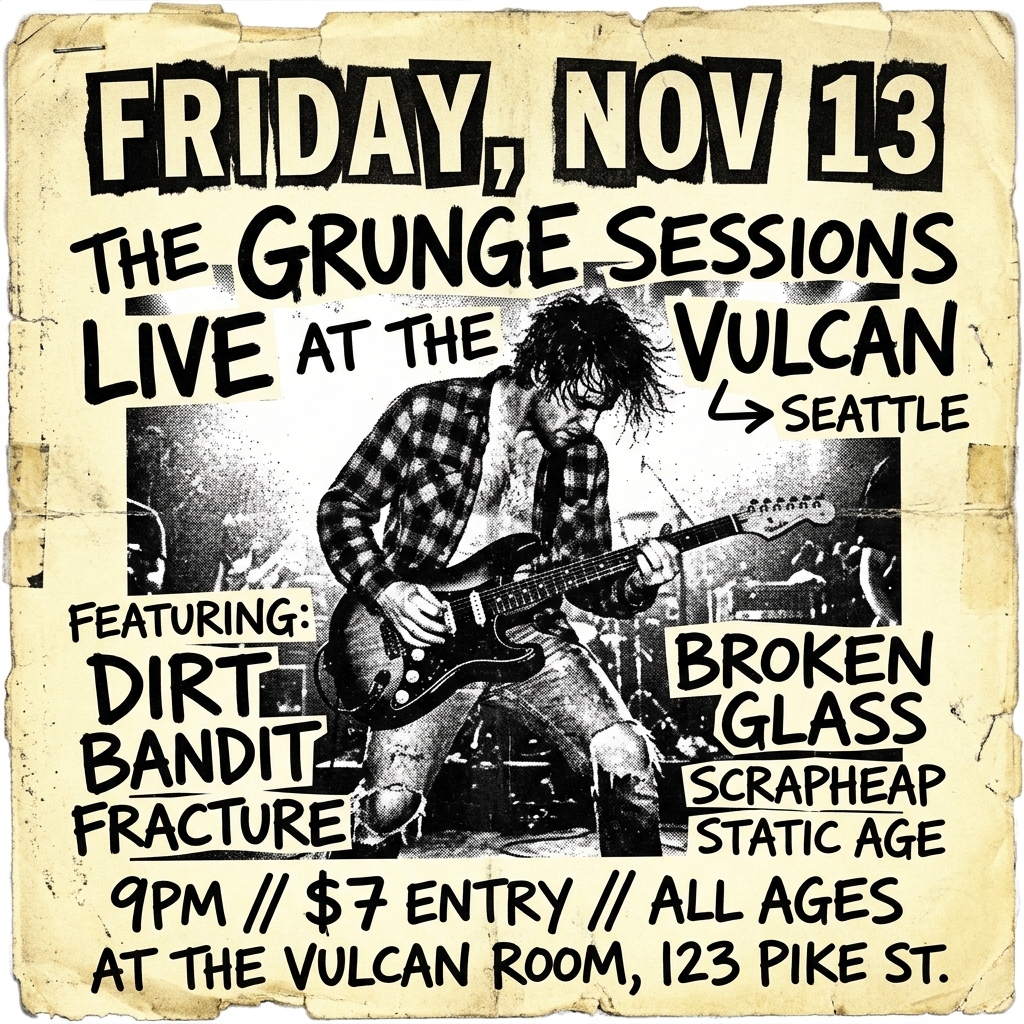
Before grunge had a name, it had a look — photocopied flyers stapled to telephone poles outside Seattle venues, hand-scrawled setlists, album art that looked like it survived a basement flood. Nirvana's Nevermind was polished on purpose (the irony wasn't lost on anyone), but Pearl Jam's Vs. and its stark livestock photography, Alice in Chains' tripod artwork, Mudhoney's xeroxed chaos — that was the real visual DNA. It wasn't designed. It was assembled.
Then David Carson blew typography apart. Ray Gun magazine (1992–2000) treated readability as optional. He set entire interviews in Zapf Dingbats. Columns bled off pages. Photos were scratched, layered, degraded. Carson wasn't illustrating grunge — he was proving that destruction was a valid compositional tool. The establishment hated it. Kids pinned those pages to their walls.
Distressed textures, torn paper edges, misregistered ink — these weren't aesthetic choices born from software filters. They came from actual physical processes: bad photocopiers, wheat-paste residue, rained-on gig posters. The roughness was evidence of lived experience. Anti-design became the only honest design for a generation that rejected the slick corporate visual language of the 80s.
Kullanım Alanları
When the brief demands authenticity over polish. Music labels launching vinyl reissues or new underground acts. Streetwear drops that need to feel found, not manufactured. Skate brands whose audience can smell corporate design from three blocks away. Zine culture, alternative festivals, any project where looking too clean would be a credibility problem. Not for healthcare. Not for fintech. This aesthetic earns trust through visible imperfection — use it where that currency matters.
Tasarım Prensipleri
- Destruction as composition — tear, layer, and degrade with intention. Every rip should create a new visual relationship, not just noise.
- Texture carries meaning — distressed surfaces communicate history, use, and realness. Flat digital perfection is the enemy.
- Typography as rebellion — break grids, overlap text, let letterforms collide. Legibility is a spectrum, not a binary.
- Analog process over digital simulation — reference real physical artifacts (photocopies, screen prints, wheat-paste) rather than applying Photoshop filters to clean layouts.
- Restraint within chaos — the best grunge design has underlying structure. Total randomness reads as lazy. Controlled destruction reads as confident.
Teknik Özellikler
Distressed textures, torn paper, xerox copy artifacts, chaotic typography, handwritten notes, duct tape elements, grainy photos, misaligned grids
✓ Full / ✗ No
Geliştirici Belgeleri ve Kodlar
# DESIGN.md — Grunge Rock dos Anos 90

## Rationale & Metadata
- **Era:** Early 1990s Alternative Scene
- **Type:** Raw, Gritty, Anti-Design
- **Keywords:** grunge, 90s rock, raw, gritty, anti-design, distressed, xerox, zine, chaotic, authentic
- **Use Case:** Landing pages, SaaS

## Color Palette
### Primary Colors
- Faded Black: `#2E2E2E`
- Dirty Yellow: `#B5A642`
- Muted Red: `#8C2727`
- Off-White: `#E9E1D4`

### Secondary Colors
- Olive Drab: `#6B8E23`
- Denim Blue: `#3B5998`
- Concrete Grey: `#7A7A7A`
- Burnt Orange: `#A84700`

## Visual Effects
- Distressed textures, torn paper, xerox copy artifacts, chaotic typography, handwritten notes, duct tape elements, grainy photos, misaligned grids

## Design Principles
- Destruction as composition — tear, layer, and degrade with intention. Every rip should create a new visual relationship, not just noise.
- Texture carries meaning — distressed surfaces communicate history, use, and realness. Flat digital perfection is the enemy.
- Typography as rebellion — break grids, overlap text, let letterforms collide. Legibility is a spectrum, not a binary.
- Analog process over digital simulation — reference real physical artifacts (photocopies, screen prints, wheat-paste) rather than applying Photoshop filters to clean layouts.
- Restraint within chaos — the best grunge design has underlying structure. Total randomness reads as lazy. Controlled destruction reads as confident.

## CSS Technical Variables
```css
/* Design Tokens */
:root {
    --ds-faded-black: #2E2E2E;
    --ds-dirty-yellow: #B5A642;
    --ds-muted-red: #8C2727;
    --ds-off-white: #E9E1D4;
    --ds-olive-drab: #6B8E23;
    --ds-denim-blue: #3B5998;
    --ds-concrete-grey: #7A7A7A;
    --ds-burnt-orange: #A84700;
}
```
Act as a Senior Frontend Engineer and Expert UI Designer.
Your task is to code a complete page on the first attempt.
- Visual Theme: Grunge Rock dos Anos 90
- Details:
  Name: Grunge Rock dos Anos 90
  Type: Raw, Gritty, Anti-Design
  Era: Early 1990s Alternative Scene
  Keywords: grunge, 90s rock, raw, gritty, anti-design, distressed, xerox, zine, chaotic, authentic

Primary Colors:
  - Faded Black #2E2E2E
  - Dirty Yellow #B5A642
  - Muted Red #8C2727
  - Off-White #E9E1D4

Secondary Colors:
  - Olive Drab #6B8E23
  - Denim Blue #3B5998
  - Concrete Grey #7A7A7A
  - Burnt Orange #A84700

Visual Effects:
  Distressed textures, torn paper, xerox copy artifacts, chaotic typography, handwritten notes, duct tape elements, grainy photos, misaligned grids

Design System Variables:
```css
/* Design Tokens */
:root {
    --ds-faded-black: #2E2E2E;
    --ds-dirty-yellow: #B5A642;
    --ds-muted-red: #8C2727;
    --ds-off-white: #E9E1D4;
    --ds-olive-drab: #6B8E23;
    --ds-denim-blue: #3B5998;
    --ds-concrete-grey: #7A7A7A;
    --ds-burnt-orange: #A84700;
}
```

AI Visual Direction:
  grunge style poster design, raw aesthetic, xerox noise texture, wheat-paste texture, grunge collage, analog noise, distressed text

Checklist:
- Distressed dokuları arka plan kaplaması olarak tanımla.
- Başlıklarda Orbitron veya kalın sans-serif yazı tiplerini tercih et.
- Sayfada misaligned (kayık) grid yapısı kurgula.
- Resimleri yüksek kontrastlı siyah beyaz formatına zorla.

Rules:
1. Strictly follow the defined visual style.
2. Use clean CSS layout and premium components.
3. Make the creative decisions needed to deliver a premium result.
/* Raw Grunge Styles */
.grunge-distressed {
    filter: contrast(180%) grayscale(100%);
    background-image: radial-gradient(circle, var(--ds-concrete-grey) 1px, transparent 1px);
    background-size: 4px 4px;
}
.torn-border {
    clip-path: polygon(0% 0%, 100% 0%, 98% 8%, 100% 15%, 97% 22%, 99% 30%, 96% 38%, 98% 45%, 97% 53%, 100% 60%, 96% 68%, 98% 75%, 95% 83%, 99% 90%, 97% 98%, 0% 100%);
}
/* Design Tokens */
:root {
    --ds-faded-black: #2E2E2E;
    --ds-dirty-yellow: #B5A642;
    --ds-muted-red: #8C2727;
    --ds-off-white: #E9E1D4;
    --ds-olive-drab: #6B8E23;
    --ds-denim-blue: #3B5998;
    --ds-concrete-grey: #7A7A7A;
    --ds-burnt-orange: #A84700;
}

 Google ile Devam Et